When I was first implementing support for 3D CSS transforms in Flow a couple of years ago I came across a Web demo by Keith Clark which created an entire 3D environment purely using CSS: https://keithclark.co.uk/labs/css-fps.
The way it uses CSS to create not only the 3D geometry, but also lighting and shadow effects is very impressive. Unfortunately this didn’t work very well in Flow because our support for transform-style: preserve-3d was minimal. This meant the ordering of elements in the scene was incorrect and visually confusing. I thought it would be nice to get this demo working and complete our implementation.

For trees of html elements with transform-style: preserve-3d, the elements all share the same 3D space and their rendering order is no longer defined by their location in the DOM, but instead by their z-position in 3D space.
If we take a simple example of 3D transforms:
<body>
    <div class="parent">
        <div id="A">A</div>
        <div id="B">B</div>
        <div id="C">C</div>
    </div>
</body>
With styles of:
.parent { transform-style: preserve-3d;
     transform: translate3d(0,100px,-300px); }
#A { transform: translate3d(0,200px,100px); }
#B { transform: rotateX(0deg); }
#C { transform: translate3d(0,-200px,-100px); }
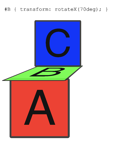
then the rendering order will be quite simple: #C should be rendered first since it has the lowest z-coordinate of -100px, followed by #B with 0px, and finally #A with a z-coordinate of 100px. Sorting items by their centres’ z-coordinates is very simple, and is often good enough to render a 3D scene, especially if items are all similar size. But we can easily break that ordering, for example rotating item #B. If we have a rotation of 70 degrees suddenly the rendering order must be exactly the opposite of the previous order, even though the z-coordinates of the items have not changed. This is because item #C now obscures item #B, and #B obscures #A. See the image below to visualise this.
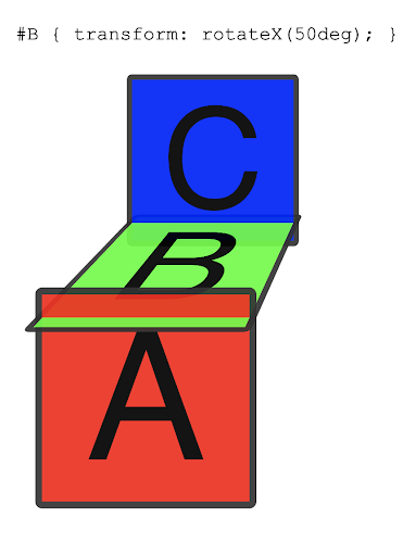
Even more complicated case occurs if we rotate #B by 50 degrees. Now #B intersects both #A and #C in 3D space. Now the rendering order must be: the back part of #B, then #C, then the centre of #B, then #A and finally the front part of #B.
Since Flow renders everything on the GPU using standard 3D graphics APIs my initial plan was to implement this using a technique that 3D games typically use, namely depth-buffering. In this method a screen pixel buffer is used to store the depth of items for every pixel on the screen. Then items can be rendered in any order, but only pixels with a smaller z-value will be drawn to the screen and to the depth buffer.
However the main problem with this technique is that it does not work with alpha-blending, required for edge anti-aliasing, and for rendering items with transparency. When games use anti-aliasing they typically use other techniques, such as multisampling, which don’t require blending. However the overall rendering quality is not as good as that expected of a browser. Games typically try to limit the number of items with transparency and then render them separately in the correct order. However they do not handle the case of transparent items intersecting other items, and content authors must prevent this happening. Since in CSS having transparent intersecting elements is allowed, the direct approach is required, and we need to split elements into different parts along the lines of intersection with other elements.
The algorithm suggested by the CSS transforms specification for sorting items in a scene is given by Newell’s algorithm and is described in detail in the original 1972 paper. Essentially we start with a list of element items sorted by their z-coordinates, and then do extra checks on each element to decide whether they obscure any items with greater z-coordinates. If they do then the items are reordered, and the same tests are performed with the new ordering. If an item is moved more than once then items must cyclically obscure each other, such as when they intersect each other. In that case the items are split up into pieces, and added back into the list to be sorted separately.
It was quite challenging to implement the algorithm efficiently, especially dealing with the 3D maths to test whether items obscure each other, and to split the items into polygons when they intersected. However the final result was very satisfying, and Flow manages to render the scene without any glitches at a solid 60 frames-per-second.
However, looking closely at some of the objects, in particular the pipes, there are some rendering artefacts which are not present in other browsers. They are divs with 3D transforms applied, and these divs use multiple background layers. Flow renders both 2D and 3D transformed elements directly to the screen, unlike other browsers.
Anti-aliasing in browsers is typically implemented by alpha-blending against the background using partially transparent edges. Browsers use this technique for almost all rendering, including fonts and transformed elements. One downside of this technique is when edges overlap exactly, the color from layers below can leak through this partially transparent edge. The left hand image below shows a browser rendering of two touching 2D transformed divs having two background layers: a black layer on top of a red layer. Text also suffers from the same problem, so to demonstrate this the text in the image shows white text on top of green text. The red colour can be seen leaking through the edges of the divs, and the green colour can be seen through the edges of the text.
When a 3D transform is applied to the div, most browsers will no longer have any red around the edges, as shown on the right hand image below. This is because they render it without a transform into a newly allocated layer, and then that layer is rendered with a 3D transform. This has the bonus that any colors from layers below will be obscured correctly on edges, but doesn’t solve the more common cases of 2D high-quality antialiasing and of text.

The edge rendering artefacts in the demo happen because Flow renders 3D items in the same way as 2D items: directly to the screen, meaning we get the same artefacts on edges as other browsers have in 2D rendering. This was a conscious design choice as we wanted to avoid allocating a layer for every 3D transformed element which can have a massive impact on memory usage. For example, when rendering this demo at 4K resolution, Flow uses around 7MB in static GPU textures, and depending on the viewpoint, 50-100MB in temporary GPU surfaces (to deal with lots of intersecting geometry). When using the Frame Rendering Stats tool in Chrome, the GPU memory usage is shown to be anywhere between 200-600MB depending on the viewpoint. Flow’s approach to 3D is possible because its rendering engine is designed around the GPU, and we’ve tried to ensure that everything that can be rendered in 2D can also be rendered in 3D. This means that rendering 3D effects in Flow is viable even on embedded devices with limited memory.
Although the pipes in the demo can look worse than in other browsers, the walls and floors look better in Flow. Flow renders images using trilinear filtering instead of the bilinear filtering used by other browsers, smoothing out the pixels in the distance. When panning around the view, this prevents pixel artefacts popping in and out.
If you’d like to automatically receive our posts by email please join our mailing list.


