Last month we were shown a new HTML UI from one of our embedded partners. When displayed in Flow, it showed a button with text incorrectly displayed over an icon. We’ve known for a while we had a few problems with buttons as many of them were the wrong size, or their content wrapped too soon. This gave us a good reason to investigate them all.
It turns out, the contents of Flow’s buttons were laid out as if everything were a flex item, not quite following the spec. Since flex items can not float, any button with a float inside would render incorrectly.
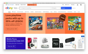
Buttons are used far more often than I’d expected and pleasingly, with this fixed, many sites looked far better. The Guardian and eBay now render their down arrows in the correct place without strange wrapping, and The WorldWideWeb Rebuild now renders its missing title bar icons.
As this button fix showed major layout improvements on many of the websites we have blogged screenshots of, it seemed a shame to not fix the remaining layout bugs.
After the buttons were fixed, all the alignment and sizing layout bugs at the top of YouTube had gone away. It has a problem with search results, but the only remaining problem with the rendering was a few centimetres of whitespace below the video, above the title. YouTube’s stylesheet is enormous and it at first appeared to be a CSS variable or a flex bug. After a lot of test-case trimming, it turned out to be that we hadn’t yet implemented percentages inside CSS calc() when applied to padding properties, in this case, padding-top: calc(9/16*100%). Helpfully, that code had been written a while back but hadn’t then been tested enough to commit.
Outlook demonstrated the most bugs in Flow but some were trivial fixes once we understood the problem. The horizontal alignment of each email subject was down to incorrectly subtracting the padding twice from the flex-basis size. The PDF icons had an enlarged grey background because of a problem with box-sizing: box-border when calculating the intrinsic sizes. Both took far longer to figure out what the problem was, than to fix it.
The magnifying glass in the search icon was too low, which turned out to be another flex bug (‘the main size of a fully inflexible item with a definite flex basis is, by definition, definite’). We also didn’t support placeholder text on input elements which needed shadow trees to be mostly implemented. After that, we found the ‘Search’ text was in the wrong colour which was due to Outlook’s CSS not using ::placeholder, only the various vendor prefixes.
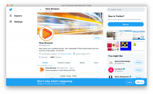
Finally, Twitter has a redesigned page since we last took a screenshot so it’s hard to know if the original alignment issues on there have been fixed or not. The new page had some problems that we had to fix. The search box in the top right was missing (actually off the right edge of the window) and each tweet’s date was vertically aligned incorrectly. The search box was off the side because it is absolutely positioned and positioned in relation to an incorrectly calculated static position. The incorrect date alignment was because the baseline code was skipping the baselines of flex containers.
If you’d like to automatically receive our posts by email please join our mailing list.


